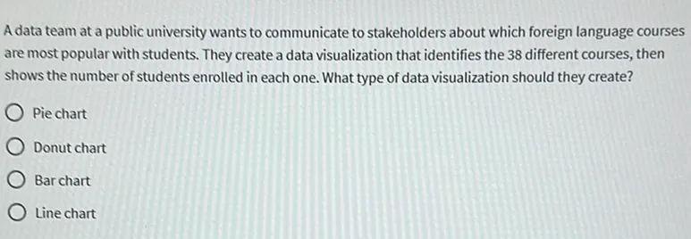
Homework Help: Questions and Answers: A data team at a public university wants to communicate to stakeholders about which foreign language courses are most popular with students. They create a data visualization that identifies the 38 different courses, then shows the number of students enrolled in each one. What type of data visualization should they create?

Answer:
First, let’s understand the question: Its about the best type of data visualization to use for a data team at a public university that wants to communicate the popularity of different foreign language courses among students.
Now, let’s analyze each given option to determine the correct answer (option):
Given Options: Step by Step Answering
a) Pie Chart:
- A pie chart is useful for showing proportions or percentages of a whole. Since there are 38 different courses, a pie chart would likely be cluttered and difficult to read, especially when comparing small differences between courses.
b) Donut Chart:
- A donut chart is similar to a pie chart but with a hole in the center. Like the pie chart, it is used to show proportions and is not ideal for comparing a large number of categories (38 courses) because it can become cluttered and hard to interpret.
c) Bar Chart:
- A bar chart is excellent for comparing the number of students enrolled in each course. It allows easy comparison across different courses, making it straightforward to see which courses have higher or lower enrollments.
d )Line Chart:
- A line chart is typically used to show trends over time. Since the problem does not involve changes over time but rather a comparison of the number of students in different courses, a line chart is not suitable.
Final Answer
Based on the above analysis, the correct answer is:
c) Bar chart
The best type of data visualization for comparing the number of students enrolled in each of the 38 different courses is a Bar Chart.
Learn More: Homework Help
Q. In the context of data processing what is the purpose of applying an additional filter?
Q. The error “only aggregate expressions use field aliasing” occurs in what context?
Q. When was the first version of the Ledger cryptocurrency wallet released?

